Randomness is a very underrated tool in data visualizations. The reason we respond to charts is because the human mind is so good at spatial pattern recognition. But if we are looking specifically for patterns, what role does randomness play in exposing patterns?
Consider the following use case using data from Star Wars API.
import swapi
import pandas as pd
import seaborn as sns
import re
import numpy as np

if 'people_data' not in globals():
    people_data = swapi.get_all("people")
def swapi_get_species_name(val):
    """
    """
    try:
        name = val.get_species().items[0].name
    except:
        name =  'unknown'
    if name == "Human":
        return name
    elif name == "Droid":
        return name
    else:
        name = "Other"
        return name

people_frame = pd.DataFrame([{'name':person.name,
                    'species':swapi_get_species_name(person),
                   'number_of_films': len(person.films)} for person in people_data.items])
sns.catplot(x="species", y="number_of_films", jitter=False, data=people_frame);

This chart seems pretty straightforward. It summarizes characters by species and how many of the Star Wars movies they have appeared in. It shows us that no non-human Star Wars character has appeared in more than seven Star Wars films.
But if we add some randomness we can expose a deeper meaning to the chart. Seaborn, the charting library used here, does this automatically applying "jitter" which randomly shifts each point to appear near it entry on the x-axis. Furthermore, we can ask use Seaborn's 'swarm' option which ensures no points overlap.
sns.catplot(x="species", y="number_of_films", kind='swarm', data=people_frame);

From this chart our conclusion changes. Because we can see the full distribution of the data, we now know that distribution of human and non-humans appearing in recurring roles is actually relatively even. There may be a few more recurring Human characters but it is not as lopsided as shown in the first chart. No obviously this chart doesn't account for screen time, or number of lines spoken.
Randomness helped add a dimension to this chart. Everyone should read Seaborn's great documentation on swarm plots for better examples. Fundamentally, randomness served to reveal density where there are many attributes of the same value.
Lack of Precision
Randomness can also be useful when there is a lack of precision in data. Consider charts showing the density of people and buildings. Density is defined as the number of observations documented in a given area. Rarely do we know the exact location of each point but we know the bounding box of where they occurred. Placing a point at the center of each area would hide the density but if we randomly distribute the points within an area, we can visualize the density in an intuitive way.
Let's look at this through an example using population mapping. This example borrows data from our past post on Layering Maps and Data.
Areas in the case are census tracts. The traditional approach might be to place a single circle in the center of each census tract and have the size of each point vary by the number of households.
import geopandas as gpd
import altair as alt
import pandas as pd
import json
alt.data_transformers.enable('json')

census_tracts = gpd.read_file("data/census_tracts_ma/tl_2018_25_tract.shp")
households_data = pd.read_csv("data/census_tracts_ma/ACS_17_5YR_S1903.csv", dtype={'GEO.id2':str}).rename(columns={
    'HC01_EST_VC02':'number_households', 'GEO.id2':'GEOID',  'HC01_EST_VC04':'white_households',
    'HC01_EST_VC05':'aa_households', 'HC01_MOE_VC07':'asian_households','HC01_EST_VC06':'Native_American',
    'HC01_EST_VC08': 'native_hawaiian', 'HC01_EST_VC09':'some_other'
})
crs = {'init' :'epsg:4326'}
census_tracts = census_tracts.to_crs(crs)

columns = ['number_households','GEOID','white_households','aa_households','asian_households',
          'Native_American','native_hawaiian','some_other']
census_tracts = census_tracts.join(households_data[columns],rsuffix='ich')
filtered_census_tracts = census_tracts[(census_tracts.COUNTYFP == '025') &
                                      (census_tracts.AWATER/census_tracts.ALAND < .55)]

boston_boundary = gpd.read_file("data/towns/TOWNS_POLY.shp").to_crs(crs)
boston_boundary_features = json.loads(boston_boundary[boston_boundary.FIPS_STCO == 25025].to_json())
altair_boston_boundary = alt.Data(values=boston_boundary_features['features'])


base = alt.Chart(altair_boston_boundary).mark_geoshape(fill='lightgray',stroke='white', strokeWidth=1.25).encode(
)
data_to_chart = pd.DataFrame([{'latitude':z[1].y, 'longitude':z[1].x, 'number_households':z[0]} for z in zip(filtered_census_tracts.number_households,  filtered_census_tracts.centroid)])

points = alt.Chart(data_to_chart).mark_point(filled=True, opacity=.8).encode(
latitude='latitude:Q',
longitude='longitude:Q',
size=alt.Size('number_households:Q', bin=True))

base + points

This simple example does work and broadly does show the density of tracts throughout the boston area. But since we know the area of each census tract we have the opportunity to distribute each household within the area. This requires a bit of pandas magic:
- We will create a dummy array of one race value for each household in the census block according the numbers provided by the census then proceed to finding random points.
- For each census tract, we will calculate a "bounding box" which is a standard rectangle that encompasses the full polygon of the census tract.
- Now that we have nice rectangle, we can calculate a random position within the x,y ranges for that rectangle.
- In a loop, we will calculate one random point for each household from the census data.
- We test to make sure that point exists within the actual census tract and if it is not we regenerate. This might create a few extra cycles but its worth it.
from random import uniform
from shapely.geometry import Point

def create_random_point(bounds, tract, race):
    """
    Credit to https://gis.stackexchange.com/questions/6412/generate-points-that-lie-inside-polygon
    for inspiration on this.
    """
    minx, miny, maxx, maxy = bounds
    geometry = tract.geometry
    def create_test_point():
        x = uniform(minx, maxx)
        y = uniform(miny, maxy)
        return Point(x, y)
    test_point = create_test_point()
    while not test_point.within(geometry):
        test_point = create_test_point()
    return {'latitude':test_point.y, 'longitude':test_point.x, 'race':race}

def get_tract_points(tract):
    bounds = tract.geometry.bounds
    counter_list =  ['white']*tract.white_households + ['african_american']*tract.aa_households + \
                    ['asian']*tract.asian_households + ['Native_American']*tract.Native_American + ['native_hawaiian']*tract.native_hawaiian + \
                    ['other']*tract.some_other
    tract_points = []
    for race in counter_list:
        tract_points.append(create_random_point(bounds, tract, race))
    return tract_points


all_points = pd.concat([pd.DataFrame(get_tract_points(tract)) for tract in filtered_census_tracts.itertuples()])
domain = ['white', 'african_american', 'other', 'asian', 'Native_American',
       'native_hawaiian']
points = alt.Chart(
    all_points,
    title="One Point per Households in Suffolk County Boston Massachusetts Colored by Median Income"
).mark_point(
    size=.3,
    opacity=.5,
    filled=True
).encode(
    latitude='latitude:Q',
    longitude='longitude:Q',
    color=alt.Color('race:N', scale=alt.Scale(scheme='dark2', domain=domain))
)


(base + points)

This post was inspired by the fantastic Racial Dot Map, a project by the University Virginia. This fascinating view provides a realistic view of racial pockets throughout the country and it is driven by the exact same approach we have here.
Here is a view from that project of the same region.
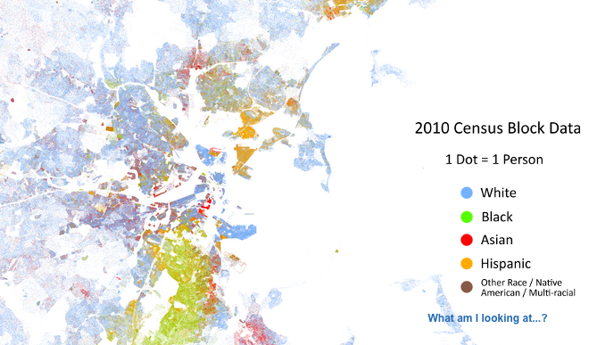
Note the improved granularity of the of their result. This again is example of precision. The Racial dot project used census blocks the smallest area of geography for which the US Census provides data while we are relying on census tracts in the image above.