Randomness is a very underrated tool in data visualizations. The reason we respond to charts is because the human mind is so good at spatial pattern recognition. But if we are looking specifically for patterns, what role does randomness play in exposing patterns?
Consider the following use case using data from Star Wars API
Layering Maps and Data?
At Algorex Health, we make a lot of maps and get a lot of questions about the tools we use to make them. So, I thought I would briefly describe our process and the tools we use. I covered the basics of geographic charting in a past blog post and some of that terminology will be repeated here.
Who is going to Orlando?
This week the health world turns to Orlando for the annual conference of the Health Information Management Systems Society annual conference. it is absolutely one of the biggest events in health IT and one of the top 25 trade shows in the entire country.
How many people attend HIMSS each year? We could search one of hundreds of press releases about the event from exhibitors. We could visit the link above from Trade Show news.
Calculating Obesity from FHIR Data
When parents bring their kids to the pediatrician, one of the most important checks is to have the childs heigh, weight, and BMI plotted on growth charts to understand their development. The charts, a screen of which appears below, are ubiquitious.
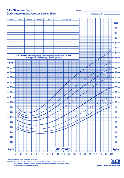
Sure enough, many many EHRs automatically show the graph and the patient's position on the chart right there making it easy for physicians and patients to review. They included automated features to measure growth velocity etc. However while the EHR stores the BMI, height, and weight measurements, Most systems do not store the comparative measure of those values for the child's age. This leaves analysts and data scientists in a tricky position when it comes to estimating obesity. How do we identify children who may be obese absent this information?